In this lab I have to redesign all maps I made previously during the course in a proper way. The original maps are published in below posts. Please fill free to comment.
Lab. 1: Qualitative Map
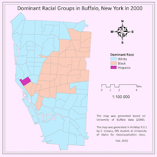
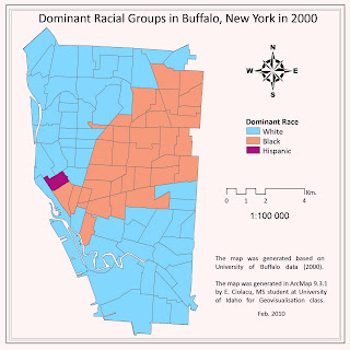
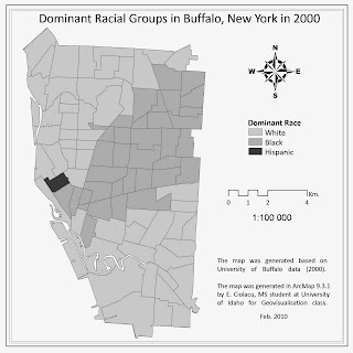
The qualitative map presents the dominant racial groups for Buffalo based on three ethnic groups: white, black and hispanic. In order to generate the map was used ethnic data from U.S. Census Survey for 2000 year, data source: University of Buffalo.
I made the layout smaller in order to have less empty areas (did not change the scale). Change the legend (less words and remove “Legend”). I changed all texts font to Calibri and the position of title to neat line. Then I played with colors till found a better lucking variant and exported it. The last one was open in GIMP, a free graphical software, where played again with colors and also converted as grayscale. Graphical software have some priority in handling colors in comparison with ArcMap, it allow changing hue, saturation, contrast easily at all image which help a lot to find out good-looking color schemes. Also it support vector data as eps files so there is no lose in details.
Lab.1: Multilayer map
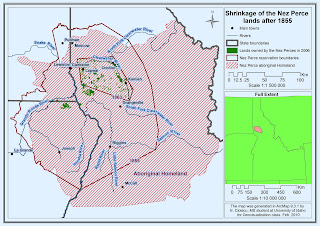
I made just some minor changes: remove “Legend”, add scale to inset map, changed a little background color, and made less red on map.
Lab.1: Simplification map
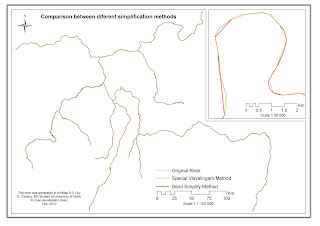
The map above presents differences between two methods of simplification in comparison to original not simplified data: Special Visvalingam method (Mapshaper website http://mapshaper.com/test/demo.html) and Bend Simplify method (ArcToolBox). To generate the map was used Geog 390 course materials.
First off all I add an inset map. Also I changed legend and position text.
Lab. 2: Introduction to Macromedia Freehand
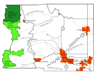
The map was created with Macromedia Freehand, a vector graphical software, and represents Boulder, Colorado area. The map show Rocky Mountain National Park, Indian Peaks Wilderness, roads, rivers and localities. The map was generated based on Geog 390 course materials.
I changed the text to Calibri, made smaller size. Changed colors for localities and rivers. Play with hue and lightness in GIP.
Lab.3: Data classification.


No comments:
Post a Comment