Friday, May 7, 2010

Final Project

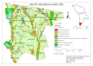
For my final project I constructed two maps which represent two different areas from my native country Moldova. In my first map I used proportional symbols technique to map nitrates pollution of wells from one of the country villages. My second map represents the land use of South Moldova. For this map I used choropleth mapping. Both maps are generated based on real data which come from research made in last few years at different organizations. Also I chose to use these data as there are in different ways related to me. In one project I took part as a contractor while the data from other I am using for my MS thesis.

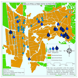
Map 1: Wells Polluted with Nitrates

The map represents wells in Bolduresti village and its level of nitrates pollution. Mapped area is located in the western part of Moldova and represents a village with a population round of 3500 inhabitants. The data on which the map is based came from WiSDOM - Women in Sustainable Development of Moldova organization from the project “Promote Sustainability Approaches and Good Practices to Improve Rural Communities’ Livelihoods of Moldova”. In this project my duties was to map all wells from where was taken water samples. Because the project has as a goal also to involved local people all the samples was taken by the local school children. From the beginning it was planned to take 100 hundreds of water samples. This number of samples did not cover all village wells but was assumed that will give a general overview of situation. All samples were tested in the same day for pH and nitrates at Institute of Chemistry from Academy of Sciences of Moldova at ion meter.

In order to represent the nitrate values in an accessible way for general public I used proportional symbols technique. I divided all values in four groups:

Up to 50 mg/l – which is considered safe by the low

Up to 100 mg/l – which is considered safe too by different health organization

Up to 200 mg/l and 390 mg/l which are not safe. I broke this in two classes in order to have a more homogeneous classification.

Map2: South Moldova Land Use

The map represents the land use in the south part of the country. The map represents ten different types of land utilization in mapped area. The data came from a project made at National Institute of Ecology, in present Institute of Ecology and Geography from Academy of Sciences of Moldova. The project “Delineation of Environmentally Sensitive Areas in Republic of Moldova: GIS Aproach” the data came from took place in 2003-2005.

In order to represent land use I used a choropleth map technique with a qualitative color scheme.

Thursday, April 29, 2010

Map of the week

The map show where is located Russian military bases in former soviet republics. In some of the countries these bases have an invasive character as the host countries are not paid and also sustain separatists’ regimes.

Map retrieved from: http://marker.ru/news/520

Lab. 6: Dot Mapping, Proportional symbol mapping, Bivariate Mapping

The map represents 50 – 64 years old population in Idaho State. Each dot represents 7 persons. The map was generated based on US Census Bureau data.


The map represents the world cities with a population bigger than 750 000 inhabitants. To generate the map was used ESRI data. To represent cities populations was used proportional symbols.


Bivariate map show population older than 65 years in Buffalo represented as proportional symbols and as a coropleth map showing its percentage. The map is based on SUNY-Buffalo data for 2000 year.


Saturday, April 17, 2010

Map of the week

Nowadays PC games are ones of most popular programs which we run on our computers. Because of non linear game play and a tremendous variability of personages and quests Lineage II became one of the most popular on-line games. In next two maps is presented the world of Lineage in version of Chaotic Chronicles four and five. You could see some addition of new pieces of land in fifth one. Maps retrieved from:
Lineage II Chaotic Chronicles 4

Lineage II Chaotic Chronicles 4


Friday, April 16, 2010

Lab. 5: Interpolation.

The map represents annual precipitations average for Idaho State. The map is based on “Introduction to Geographic Information System” book CD data. To generate the map was use Inverse Distance Weighted algorithm.


The map represents annual precipitations average for Idaho State. The map is based on “Introduction to Geographic Information System” book CD data. To generate the map was use Kriging algorithm.

Wednesday, April 7, 2010

Map of the week

This set of maps represents one of the protected areas in Republic of Moldova named Padurea Domneasca (Lord's Forest) and the land use of the area. The maps were created by me in the summer of 2009.

Note: in Europe is used comer instead dot.


Wednesday, March 31, 2010

Lab. 4: Review of Lab. 1 – 3 maps.

In this lab I have to redesign all maps I made previously during the course in a proper way. The original maps are published in below posts. Please fill free to comment.

Lab. 1: Qualitative Map

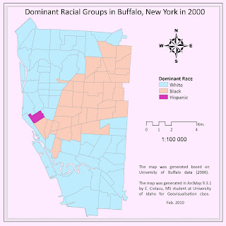
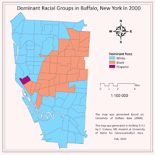
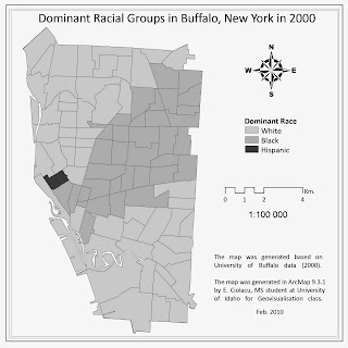
The qualitative map presents the dominant racial groups for Buffalo based on three ethnic groups: white, black and hispanic. In order to generate the map was used ethnic data from U.S. Census Survey for 2000 year, data source: University of Buffalo.

I made the layout smaller in order to have less empty areas (did not change the scale). Change the legend (less words and remove “Legend”). I changed all texts font to Calibri and the position of title to neat line. Then I played with colors till found a better lucking variant and exported it. The last one was open in GIMP, a free graphical software, where played again with colors and also converted as grayscale. Graphical software have some priority in handling colors in comparison with ArcMap, it allow changing hue, saturation, contrast easily at all image which help a lot to find out good-looking color schemes. Also it support vector data as eps files so there is no lose in details.


Lab. 1: Quantitative map

The qualitative map presents the percentage of children from Buffalo of 5-17 year old. In order to generate the map was the same data from U.S. Census Survey for 2000 year, data source: University of Buffalo.

I changed layout using one of the ArcMap modified template. All texts were changed to Calibri. I completely changed the legend and move the title to the bottom of the page. I used one of sequential color scheme suggested by scheme ColorBrewer website with some changes. The map was exported as picture and open in GIMP where play with color in order to obtain a better color scheme. Also I made a map with one of the ArcMap divergent color scheme option. Also remade in GIMP.


Lab.1: Multilayer map

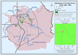
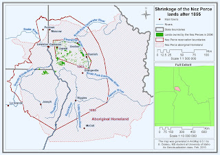
The map above presents changes of Nez Perce aboriginal homeland reservation from initial homeland to 2006 state. The map was generated based on Geog 390 course materials.

I made just some minor changes: remove “Legend”, add scale to inset map, changed a little background color, and made less red on map.


Lab.1: Simplification map

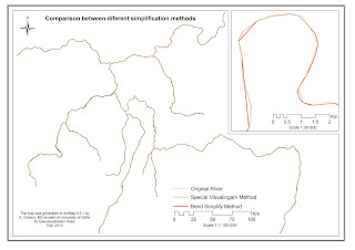
The map above presents differences between two methods of simplification in comparison to original not simplified data: Special Visvalingam method (Mapshaper website http://mapshaper.com/test/demo.html) and Bend Simplify method (ArcToolBox). To generate the map was used Geog 390 course materials.

First off all I add an inset map. Also I changed legend and position text.


Lab. 2: Introduction to Macromedia Freehand

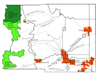
The map was created with Macromedia Freehand, a vector graphical software, and represents Boulder, Colorado area. The map show Rocky Mountain National Park, Indian Peaks Wilderness, roads, rivers and localities. The map was generated based on Geog 390 course materials.

I changed the text to Calibri, made smaller size. Changed colors for localities and rivers. Play with hue and lightness in GIP.


Lab.3: Data classification.

The map shows differences between different methods of classification based on percentage of white population in Idaho for 2000. The maps were generated based on U.S. Census data. To construct maps was used next types of classifications: Natural Breaks, Equal Interval, Quantiles and Optimal.

I changed color scheme to a divergent one. Also changed layout a little and add background color.


Tuesday, March 30, 2010

Lab. 3: Data classification.

The map shows differences between different methods of classification based on percentage of white population in Idaho for 2000. The maps were generated based on U.S. Census data. To construct maps was used next types of classifications: Natural Breaks, Equal Interval, Quantiles and Optimal.

Lab. 2: Introduction to Macromedia Freehand

The map was created with Macromedia Freehand, a vector graphical software, and represents Boulder, Colorado area. The map show Rocky Mountain National Park, Indian Peaks Wilderness, roads, rivers and localities. The map was generated based on Geog 390 course materials.